


chiisu81
-
Posts
45 -
Joined
-
Last visited
-
Days Won
1
Recent Profile Visitors
1,003 profile views


chiisu81's Achievements
")
Newbie (1/4)
33
Reputation
-
 I think it's mostly having both on the same page. Perhaps if just 1 entry/image per page, in landscape orientation, it'd be easier to read. I whipped up something in LibreOffice, just using a bitmap background and choosing a free/open handwriting font. That font def. has to balance between readability and looks, so feel free to change it in the ODT if you prefer. LightlessBeaconHandout2.odt LightlessBeaconHandout2.pdf
 -
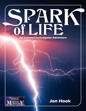
Jon Hook has a new scenario out, Spark of Life, this one designed for a Keeper and one Investigator. In the preview I really like the page background! I know not everyone's a fan of them, and I don't know if the PDF utilizes layers to hide it and/or save ink on printing, but I noticed it and was easy on my eyes.
-
Ooh... look what arrived in the mail yesterday.
chiisu81 replied to lawrence.whitaker's topic in Mythras
Unless my eyes are bad, back text second paragraph: remove comma after "Companion", and add a period after "together". -
chiisu81 changed their profile photo
-
Ooh... look what arrived in the mail yesterday.
chiisu81 replied to lawrence.whitaker's topic in Mythras
Color interiors?! 😎 -
There's nothing to move, as this is just a thread in the Upcoming Games section. Any Delta Green posts can go under the Call of Cthulhu section, as its byline says "... and other RPGs based on the Cthulhu Mythos", maybe with a [Delta Green] tag in the thread title to help differentiate it. Of course mods please correct me if I'm wrong.
-
Does the DTRPG version not use the heavyweight paper (since it's not indicated)? If no offset printed edition is available I'd at least like to have the heavier paper used via PoD...
-
Hope it's ok to post this here, since it's pseudo-related: Dead Light is DriveThruRPG's Deal of the Day! - save 50% off I've seen this adventure recommended a lot recently, and I finally caved in and got it. Look forward to reading it!
-
Will at least the core book still be available in a traditional off-set printed edition from your store? I've had mixed "success" with POD books, but for some games/books I am happy to pay a little more for a higher-quality printed copy. My Mythras (1st printing likely) from y'all is just exquisite!
-
And I do appreciate the continued response! And it's not like I won't eventually get Lonely Lighthouse (and the few other adventures I don't already have) anyways, whether it's a buck or 2 off in a sale. Perhaps closer to Christmas y'all could have a sale on the TDM Store website, where y'all get a "bigger cut"?
-
3 items released since Lonely Lighthouse are marked on sale: https://www.drivethrurpg.com/product/246666/TDM204-Waterlands?src=newest https://www.drivethrurpg.com/product/247862/TDM124-Agony--Ecstasy?src=newest https://www.drivethrurpg.com/product/239142/The-Fenix-Papers?src=newest I just find it strange as it seems all the other Mythras/Classic Fantasy adventures are on sale. And it's hard for me to believe that publishers would have apparently no control over what gets marked for sale in these type of multiple-publisher sales. It's just frustrating as a fan and repeat potential purchaser...
-
Is Lonely Lighthouse supposed to be included in the sale as well?
-
LOVE the cover art and green logo!
-
That is a REALLY good price point! For physical RPG items that moves it into "impulse buy" territory, at least for me...
-
Need to update http://thedesignmechanism.com/about-us.php with it. Also, those 3 links/buttons should also be on the main page as well.
-
I compared them within Acrobat Pro, it found no differences in the text.


