


Sayerson
-
Posts
92 -
Joined
-
Last visited
-
Days Won
1
Content Type
Forums
Blogs
Gallery
Downloads
Profiles
Events
Everything posted by Sayerson
-
Condolences to Greg's family and friends. A loss for all.
-
 Thought that was already explained?
 -
This may be better for conferencing. https://www.amazon.de/MXL-MXLAC404-AC404-USB-Konferenzmikrofon/dp/B001TGTDFM/ref=mp_s_a_1_15?__mk_de_DE=ÅMÅZÕÑ&qid=1528651778&sr=8-15&pi=AC_SX236_SY340_FMwebp_QL65&keywords=conference+microphone
-
Agreed but probably a built in one with the camera (Logitech likely). Only lower on speaker use when played over a phone. Attaching a headphone will help with hearing it better. Muddy is from the tonal depth but not totally horrible.
-
Start in Account/account settings/ signature (under dropdown) May be different on a laptop /desktop but that should get you there
- 1 reply
-
- 1
-

-
Definitely not what it's quacked up to be.. sorta fowl.
-
This may help.Safety Last! https://journeysinclassicfilm.com/2016/01/15/fridays-with-harold-lloyd-safety-last-1923/
-
Seems more a piece showing the artist's drawing abilty and proportion than an attempt to convey actual sizing in relation. Very nice test piece actually, for an example of content style.
-
Audio files can be very large to upload directly to any site. The upload max for files here is 500mb but with an audio file, it would be better to post a link to the file hosted elsewhere. The forum software usually handles any links that point elsewhere to audio files and "embeds" them for you if hosted.
-
Lol, Gloranthaphiles - generally a scruffy lot of nerfherders* See YGWV for additional context
-
Meh. Better than the second
-
I'll say that the quickstart logo was good but liking this one. It's more basic but is quick to grow on a person. I'm also assuming it is going to be color changed for different covers but if not, works just as well. Thanks for ditching the second one though. That seemed a wreck.
- 67 replies
-
- 1
-
-
- runequest
- runequest: roleplaying in glorantha
- (and 3 more)
-
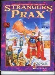
Strangers in Prax as well.
-
@Jeff long as the rules do.
-
Thanks for the link
-
Looks like just about the right size. Hopefully a lot of the stuff not mentioned so far has been play tested by more than fan boys and newbs. Guess we'll see come November ish. My group is still 50% interested in new scenarios more than they are with the rule previews so far but we'll see as above.
-
And nostalgia be damned but don't flush a fanbase or shortshift a new fanbase with a so so logo. Sometimes less is more.

-
Primarily, I agree: my #1 interest in the new text/title/logo thing is that it grab people's wallets (reaching in through their eyeballs). Or is that imagery to Cthulhionic for Glorantha? Secondarily, I think something that gets the grognards who recall RQ2 / RQ3 -- but somehow have missed the last few years or RQ/BRP/d100 resurgence -- to spot this on FLGS shelves and go "WTF-oh-HELL-yeah!!!" ... I think that is something worth having. Lots of comments and lots of odd associations to Grognards for some reason. The point that seems to be missing in a lot of this rhetoric is that if you have created great content and have access to a great artist's imagery and want to evoke a desire to delve into a product, then your logo should also be something evocative of your brand. That's basic sales. Not grognardism.


.png.06a927937128035c450edc9b0fd0c94c.png)


-
Even mocked up and in different colors... meh. The RQ Quickstart seemed a better logo. Logos meh.pdf
-
Looks pathfinderey to me. That or old mongoose. Thinking it needs a better font and less surrounding darkness. Usually a logo is evocative of a brand and makes one want to delve more into a product. This doesn't speak to me personally of the RQ brand and just fades into the background of the morass of rpg games already on the market but less effectively. Would rather read anything with a better logo.
-
This may be of interest to you.. https://forum.rpg.net/showthread.php?808382-The-Sabre-Rpg-(d100)
-
I tend to agree with your views and am reserving my final opinions for the actual release of the rule books BUT, like you, am happy to spend money on new resource books from the Chaosium. With Rick and MOB around, they have my group's interest. As outlined, Passions and the way that the new Rune(rube) Magic works? Not so much.
-
Just around the snout and eyes
-
I am not sure how this is an unbalanced core rule though. Dodging is less effective. And more dangerous. Maybe that is the point? Yeah, you are definitely reading only parts on an entry. Unbalancing core rules is an issue of itself - in this case combat balance. But to each their own. Some just play games no matter what.
-
I think you are overlooking his point just before that statement and should read it in the whole; "But if this is the case, it means that the PCs totally outmatch the enemies in terms of armour and magic, and it is time for the GM to provide more dangerous opponents or cast more magic in battle." Characters have a certain range of proficiencies, protection and items that a gm has to balance encounters against for gameplay sake. This would be so characters can feel challenged and not walk through 'boring and unchallenging' scenarios. Once that balance is tipped, (say, by a rule that wasn't thought out or play tested thoroughly) characters can die needlessly or take focus away from the rest of the game. So, while deadly combat has always been a standard in RQ, unbalancing core rules has serious knock on effects throughout gameplay. This is what will kill games and player characters.


.png.06a927937128035c450edc9b0fd0c94c.png)


