


Paid a bod yn dwp
-
Posts
926 -
Joined
-
Last visited
-
Days Won
3
Content Type
Forums
Blogs
Gallery
Downloads
Profiles
Events
Posts posted by Paid a bod yn dwp
-
-
Impressed with the previews of RQG, heres a few things I'd like to see realised with the new generation of Gloranthan artists
1. Lunar cities & culture
2. Notchet
3. A variety of Sartar Orlanthi settlements (Not so keen on the viking/celt/saxxon look. The square house concept is more fitting with RQ2)
4. New evocative imagery of the Elder races. (Mostli, Aldryami, Trolls) Love to see imagery from Biturian Varosh travels brought to life - Elves in their copper Armour etc
5. A strong grasp of the West its look and feel.
Not forgetting the obligatory action scene set pieces, these are just a few things I'd like to see depicted in the new RQG era. What do others feel?
-
30 minutes ago, MOB said:
I worked with Andrey on the original version, as part of a number of interior pieces for the 13G book. Jeff takes the credit for going back to the piece with Andrey and turning it into the stunning cover piece featuring the pregens with lot of wonderful new details.
Andrey started drawing for us as a Call of Cthulhu illustrator, but was intrigued by Glorantha (which he'd never heard of), to give that a try too when we asked him if he'd like to be part of finishing off the 13G project*. He's got some great pieces in 13G, and some wonderful stuff coming up in the new RQG: his Gloranthan art just keeps getting better and better as he gets drawn in deeper and deeper to the setting...
*another such artist is Caleb Cleveland, who had also done Call of Cthulhu art in the past, but had never done anything for Glorantha before. His 13G pics of the Earth Priestess and her Troll Wind Lord buddy—definitely some One Unique Thing stuff going on here—are among my favourite in that book:
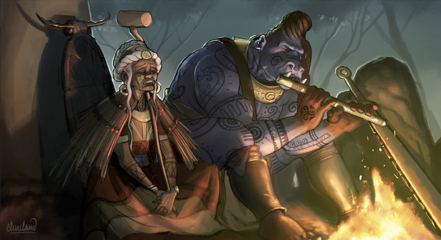
Some great art coming out in both 13th age and the new RuneQuest. Great to see justice done to Glorantha in this respect. I liked Andrey's orginal image in 13th Age, but for a cover selling the new RuneQuest these alterations have really pushed the image into what I feel the RQ vibe is about. There's something special about the ancient RQ2 feel that sold that game to me. This new art is tuning into that vibe remarkably well. Seeing the Monkey ruins come to life, and the hustle and bustle of Swenstown is marvellous. I really liked the covers for River of Cradles, Sun County & Bordelands - This art feels of the same world, but executed in Andrey's own sophisticated way. It feels right.
-
 2
2
-
-
5 hours ago, MOB said:
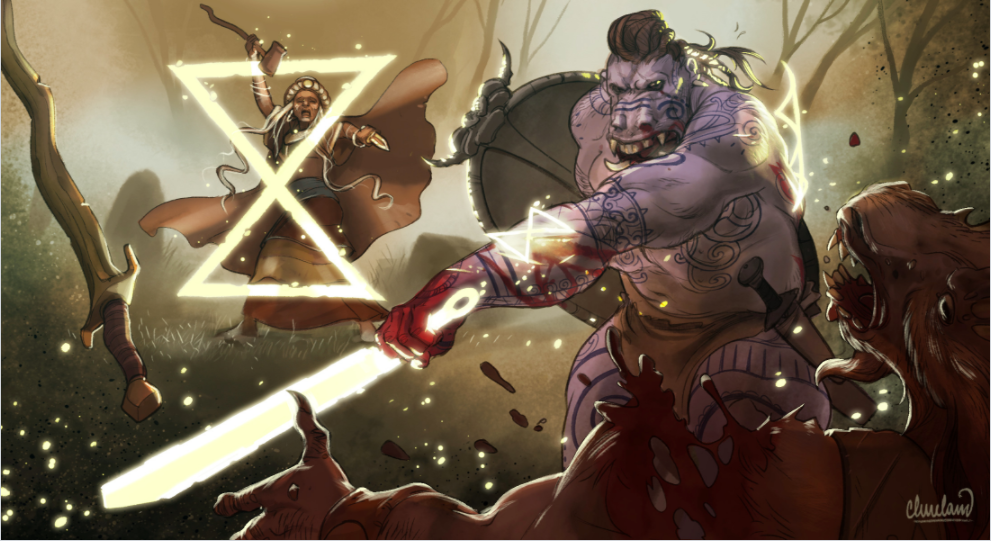
The original title of the piece was "Orlanth and his thanes" (though whether that's the Big O himself or a wind lord avatar is rather moot, as we originally commissioned it for the heroquesting chapter of 13th Age Glorantha). The revised RQG cover version upgrades Vasana's armor and swaps out the figures around the Big Blue Guy with the other example characters from the rules. Andrey's earlier version still appears in the 13G book.
The changes are what makes this worthy of the cover image IMO. Its much more interesting. The variety and change of shield styles, the supporting variety of characters which gives more personality, and develops the story. The move to a presumably warmer Mediterranean climate (less trousers) & great sandals. Getting more of a Jason and the Argonauts vibe which as cultural currency totally sells it to me (like RQ2) - whilst still be uniquely Gloranthan. The interesting variety of details and armour is much more interesting now & makes the image sing.
Having lived with the new cover and logo now for a few days, its impressing me more. The logo is very strong and unique, my initial ElfQuest association has thankfully faded. This Logo has its own characterful identity for me now. Not to put too praise on Chaosium, but this design process has been expertly steered. I 'm sold
")
-
3 hours ago, Jeff said:
In an ideal depiction, we would have gotten rid of his skirt, and made him completely nude, but I suspect that might very well violate the law in some jurisdictions. Shame, but that is what it is. His hair is wild and unkempt, like a sadhu's.
That’s where the *uncivilised* bad press comes from then
-
There’s some really important changes for me in the new cover over the version in 13th age Glorantha. These changes make it worthy of the cover picture IMO.
The decision to remove most of the trousers and give a greater mythic Bronze Age sword and sandle vibe is much more identifiable for me as the successor to the popular RQ I grew up with. Shield details, sandles, armour, clothes, more personality in the faces - Identifying with Vasna etc. We have a group with individuals which draw the viewer in. Characterisation is much stronger in the new image.
The gender balance is great, and new characters that have been included make the image much more dynamic. I’m not seeing passive disimpowerd women, or overly sexualised - If anything the men are more sexualised. On balance I think both genders are treated equally ( well perhaps except for the blue dude who has the focal point in the picture). Hats off to Chaosium for making the new example character in RQG a female.
Credit to the skill of the artist. This is a picture that keeps the viewer engaged. The changes have been crucial in that respect.
-
53 minutes ago, Jeff said:1 hour ago, Paid a bod yn dwp said:
The GM's pack has a pretty diverse range of scenarios from gritty, mundane stuff of life to epic Bronze Age fantasy.
Excellent
-
Thinking about it - Regarding *Cowgate*, the RQG QuickStart adventure was great. The tone felt right...good use of cows
-
1
-
-
58 minutes ago, Mankcam said:
The other issue is that the more I look at this cover, the more I feel that it would make a great HeroQuest cover. I agree that the tone of HeroQuest has been quite different to that of RuneQuest., and I think that this may be my main concern .
I’ve heard this sentiment from others too. Some saying it’s great, but not sure if it marries with the RQ gritty experience. It certainly promotes the high fantasy aspect .
-
54 minutes ago, soltakss said:
I am so tired of the "You are cattle herders and someone is stealing your cattle" or "Some of your flock have been killed and eaten", or "One of your cows is found with its guts torn out and a trail of small bloody footprints leading to a nearby marsh".
We were never cattle herders in our games either - not sure where all the cows came from?...but the games we had were mostly quite low level in feel, pretty much like the Rurik saga, vulnerable & death always just around the corner. Don’t get me wrong i’m Looking forward to a RuneQuest with the full range - all the way up to heroquesting.
-
1
-
-
4 hours ago, trystero said:
My first reaction to the cover art is that it's a lovely piece which would be great on a HeroQuest book. Its tone doesn't really match the tone of most of my RuneQuest games; it's larger-than-life and heroic and doesn't provide much focus on the gritty details which are (IMO) so important in RQ. But I'm trying to keep an open mind and will see whether the art grows on me.
Picture is great, but I do see this perspective as well. RuneQuest was always a gritty experience for us. Hopefully that tradition will be upheld in new RuneQuest too - as well as the expanded heroquesting stuff. Always thought Rurik’s saga complimented RuneQuests rules for gritty combat brilliantly. It set the tone well
Have to say I like the changes that have been made to the picture from the version in 13th age. It’s doesn’t leave any questions about its ancient mythic credentials, and its heritage from the RQ2
-
2
-
-
That’s stunning. Well done Chaosium. I love the attention to detail. This is the Glorantha I’ve been looking for. You’ve nailed it - Welcome back
-
2 hours ago, Jason Durall said:
At that point, it's another Celtic uncial title, which we were not thrilled with.
Yes agreed too generic, and wrong feel for RuneQuest Glorantha.
This new logo has character for me. It shirks the generic fantasy feel, and brings something distinctive to the table. I really like how it works with the runes and contrasting lettering underneath too. I think the designer has achieved a good characterful balance....I’m so pleased Chaosium didn’t stick with the last logo. This does RuneQuest much more justice.
-
Nice.
So glad Chaosium went back to the drawing board on this one. For me this captures the spirit of the game very well. It’s a pleasing strong design...phew!
I did have a *moment* of ElfQuest, but that is minor, and the thoughtful strong design is winning through. I like the stylised S, with its rightly or wrongly ancient (greek ?) association.
The QuickStart remains a lovely logo, but the new one works very well too. Great. ...Thank F**k for that!
-
1
-
-
1 hour ago, Jeff said:
Yes. We'll be showing it off soon enough.
Carry on Chaosium - This grognard is about to achieve RPG nuclear fusion *starts ascent to the sky*
-
 1
1
-
-
I guess the new cover must be done by now...
-
On 15/03/2018 at 6:16 PM, Jeff said:
As Jason said, layout is preceding forward every day. And so far the book is looking even better than 7th edition Cthulhu. It is shaping up to be the best looking book Chaosium has ever done
Funny coming back to RPGs after a very long time out - This is quite possibly the realisation of my ultimate teenage RPG dream. Can’t wait to see this...Seems I timed my return to RPG games perfectly. Not many game companies can make grown adults squeal with excitement. Hats off to Chaosium
-
4
-
-
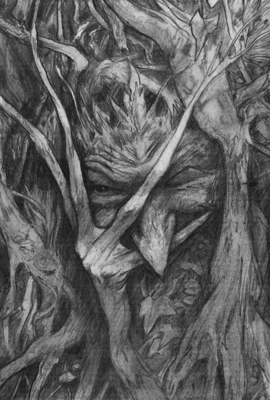
Lovely art work. I noticed that 13th Age makes the point that their book is open to all Gloranthan artist traditions. This picture for me feels close to dark age Northern Europe, perhaps a bit Viking inspired? Will RQG have a more focused approach to the art, more ancient, feeding off the early RQ2 vibe?
-
I think Chaosium are changing through the gears really well with what I've seen so far of the art direction for RQG. There's a compelling mix of styles (all excellent in their own right) which seems to me to work better then anything I've seen before. Really like the idea of bringing art into the character sheet, all adds to an immersive experience. The imagery is bringing it back to fun of RQ2 for me - The style of the helm, the old school coinage, the exotic ancient cityscape, and of course a great Wyrm...great stuff!
-
3 hours ago, Jeff said:
HeroQuest has fundamentally different mechanics from RuneQuest. And yes the Aldrya cult encourages its members to be strongly in tune with Plant, not Man (especially since elf player characters start with the Plant Rune at 75%). More Man-oriented elves tend to drift away from Aldrya towards Yelmalio, Babeester Gor, Ernalda, etc. without ever leaving Aldrya entirely. Normal elves in full embrace of the Song of Aldrya tend to be pretty difficult player characters in anything other than an all-elf party, as their kinship with and understanding of Man tends to be pretty minimal.
Thats helpful.
So presumably their appearance will reflect their relationship with the plant and man runes? So those Aldryami in tune with Aldrya will appear to be more plant ( perhaps similar to the Brian Froud illustration concept i posted), and Yelmalio, Babeester Gor, Ernalda worshippers appearing more humanoid?
look forward to seeing examples of the various forms of Aldryami in the new RuneQuest. The more accessible Aldryami could make interesting player characters. Are there examples of how to play a Yelmalio, Babeester Gor, or Ernalda Aldryami?
-
The presentation of RQ3 Elder secrets left a lot to be desired I’m sure all agree, but one thing I remember feeling after reading about the Aldryami was that formula for the cult write up felt conceptually at odds with the nature of Aldryami. Too rigid and mechanical.Too formulaic, too mostali.
I guess it wasn’t helped by the dry presentation and poor art direction.
Still i’m really intrigued to see where Chaosium will take the Aldryami. They have found a good fit with the artist Andre Festov.
-
I have to admit to being left cold by many of the attempted depictions of Aldryami
Frouds work combines elements of intense observation of natural forms realised through his great draughtsmanship, with a subdued palette, which seems to me to be the most effective way of tapping into the aesthetic possibilities of Aldryami. Natural forms, with a earthy inspired palette. Without that keen observation of natural plant/tree forms the concept of the Aldryami falls flat. Not saying Froud is it, but he's hitting on elements that make the concept work
-
4
-
-
27 minutes ago, Jeff said:
Actually from my perspective, it has shown me the opposite. There are several play-styles and traditions in play here, and where practicable, the rules should be written broadly enough so allow them.
I can see the advantage of this approach. I think the key thing is as Jeff says “where practicable”.
My concern is with more key mechanics being overly ambiguous.
There is admittedly a geeky satisfaction in knowing that you are playing the rules as intended. Making changes to rulings is more comfortable and decisive for some when you are clear about the stepping off point.
Having said all that there is no specific mention of excluding missile weapons from the spell fanaticism, which I would take to mean that it is applicable to both melee and missile attacks, as Jeff has confirmed.
-
2 hours ago, Grievous said:
However, if something needs to be established as a thing that can be taken in two, or multiple different ways depending on preference, then that is something that a sidebar, note, or something along those lines should accomplish. There is a huge difference in something being vague and something being optional, even if it is a case of a writer employing sleight-of-writing.
Yes , thats my feeling too. Particularly with a crunchy game like RuneQuest. A side bar explanation is very helpful in this instance, as it helps players across the board to feel comfortable with their interpretation of the rules, and comfortable with the game. Particulary relevant if the RAW rule is open to differeing interpretations
-
15 hours ago, styopa said:
It's a challenging comparison, but I would venture that elder secrets was even worse than DoD. Not sure whether the troll, elf, or dwarf that haunt me more to this day...
Yes it was truley terrible...May it never happen again.
Hey maybe now’s a good time for a new art preview for RQG...some of us are having an elder secrets relapse
-
3
-


In the new era of RQG what aspects of Gloranthan would you like to see realised with new art work?
in RuneQuest
Posted
Yep Holy Country and lunar heartlands would be great.
Love to see a return to the Rubble and Pavis too. I think the Big Rubble has fantastic potential for spectacular artwork - past achievments of a lost era in all its faded elegance.